
Showing posts with label colors. Show all posts
Showing posts with label colors. Show all posts
Monday, 16 June 2014

Monday, 19 May 2014
Colors Unknown
Blue, green, red,
yellow, black… there is an endless list of colors, there are just so many! Most
of us don’t pay attention to the lighter tones or deeper shades of a particular
color; a red is just a red to us. From the color of the sky to the color of an
eye, each color varies. There are colors that we may have seen countless times,
but would be unaware of their actual names, placing them in generalized
category. Here are some colors that most of us must have seen, but wouldn’t
know the exact name.
 |
| Malachite |
The first one is Malachite, a descendent of
green. This vibrant version of green is derived from the carbonate mineral
called Malachite or copper carbonate. The swirling patterns are associated with
the semiprecious stone and the deeper shade of green gives a rich look. During
the olden times the mineral was extensively used for green paints as it often
varied in color. This hue is seen being painted throughout history, the Malachite
room in Hermitage is one such instance.
 |
| Monique Lhuillier's Malachite |
It is widely used in décor, jewelry and even as
an accessory along with designer apparel. At the Fall 2013 show of designer Monique
Lhuillier, an impressive Malachite theme was employed with stunning gowns in
rich Malachite hue on display.
 |
| Rose Madder Madder Carmine |
Rose Madder is yet
another hue that is perceived as red. It is made from a pigment extracted from
the common madder plant called as Rubia Tinctorum. Similarly, there is Madder
Carmine which is commonly known as burgundy and sometime oxblood. Carmine is a
term for deep reds that are slightly purplish, while still being close to red. The
2013 New York Fashion Week saw this shade turn up quite a lot.
 |
| Madder Carmine |
Belonging to the blue and purple family,
Periwinkle is another color that many are not aware of. Periwinkle is the name
of a plant; it is linked to the cool blue flower of the vine-like evergreen.
 |
| Periwinkle |
The plant’s Latin name is Pervincire which means
‘to entwine’. Lavender blue is another name for it, or even pastel blue. For its
2012 Spring-Summer collection, Chanel’s Haute Couture displayed some of the
best Periwinkles ever seen.
 |
| Chanel’s Periwinkle |
The color, Chartreuse
is the point where the blue and yellow intersect. It has a rather interesting
history attached to it.
 |
| chartreuse yellow green chartreuse |
The color, Chartreuse
is a lovely mixture of blue and yellow. It has a rather interesting history attached
to it. The green hue resembled French liqueurs called green chartreuse, which
was introduced in 1764, likewise chartreuse yellow is a yellow color mixed with
a hint of green which resembled the yellow chartreuse liqueurs introduced in
1838. This color made news in Spring-Summer fashion shows a few years back.

Cerise, Xanadu, Amaranth, Fulvous, Eburnean, Smaragdine and Claret and are just a few
more names that go unnoticed. So explore the different hues, tones, shades, and
tints and create something unique and vibrantly colorful!

Wednesday, 16 April 2014
Student spotlight: Creating a Mood board
Fashion designing as
a profession and art has evolved immensely, being more accessible than ever. Different
aspects of fashion education have evolved, whereas others are still emerging. Possessing
knowledge about fabrics, colors, silhouette and cuts is imperative, but
presenting a creation holds equal significance. A mood board is one of the
methods that can be used to present a design or a collection creatively.

Mood boards (also
known as inspiration boards) help to visualize the design concepts and ideas and
explore the look and feel of a project. There is a uniformity of colors, fonts,
images, themes or layout. The mood board becomes a tool through which a
designer and clients can have a better understanding of the designs. This
covers everything, from what it needs, how to take it forward, what makes it
tick and more. The board also acts as a brainstorming device in which new ideas
can be developed or old ones refined.

A large number of
designers use mood boards, and it is not limited to the fashion industry alone.
In fact, creating an inspiration board is common for interior designers, web
designers, landscape designing, wedding planning or it could be a normal
collage made at home by a college going photography enthusiastic.

A mood board could be
created on anything- a PDF file, PowerPoint or on a physical board, bulletin or
even in a notebook. The content of the board should reflect the designer’s
idea. A fashion designer, for instance, would create a mood board in which the
theme of their collection would be apparent, the colors to be used, sketches of
the outfits, illustrations, fragments of the fabrics to be used, the source of
inspiration through which the collection has been created and anything that
will be of any relevance to the designer.

 |
| Pranali Oswal's Mood Board |
Pranali Oswal, a fashion
student of Whistling Woods Neeta Lulla School of Fashion, has created a mood
board in which she has beautifully exhibited her design and the source of inspiration.
The renderings that Pranali has done are influenced by graffiti either inspired
by the colors or by using text as print on the garment. Regarding the mood
board, Pranali believes that they are important to designers as it gives
direction to the collection while expressing the theme on its own. The board
showcases the designer’s thought process giving the ideas a visual expression.
 |
| Pranali Oswal's Mood Board |
Wednesday, 26 March 2014
Springing to life!

Spring
is here! A season filled with sunshine, lazy days, and vibrant colors that
radiate throughout your wardrobe. This season soft pastels were balanced with
vivid bright hues. A mixture of ever-inspiring nature and free spirited travel
has been an inspiration for this palette which refreshes, revives and defies
conventions. We have narrowed down the must-haves colors for men and women.
For Women
Placid Blue:

Radiating a sense of
tranquility, Placid Blue induces a sense of peace. Use this color to add a touch
of serenity to your wardrobe by adding handbags, clutches or even belts in this
pastel shade.
Sand:

Conjuring images of sun, sand
and beach, Sand is the ideal summer color. Versatile in its use, this color can
be parried with pretty much any shade. With denims, it makes for perfect street
wear, while a Sand color pencil skirt along with white or black shirt completes
a formal look. As part of a glamorous sequined cocktail dress, sand can be
ravishing too.
Radiant Orchid:

Crowned as the color of the
year, Radiant Orchid, as the name goes is a radiant and vibrant shade to possess
this season. A perfect harmony between fuchsia and purple with undertones of
pink, it is perfectly matched with pastel colors. It is a feminine color
without being overly girly.
Dazzling Blue:

This brilliant shade of blue
adds some dazzle to any pastel palette. Dazzling blue is an eye catching color but
compliments most colors beautifully. Wear it as loose trousers or jumpsuits.
Celosia Orange:

A warm hue, Celosia Orange
flatters the Indian skin tone. Pairing it with Violet Tulip will create a
captivating look.
For Men
Paloma:

This neutral shade of grey is a
must-have in a man’s wardrobe and is a soul-mate to vibrant shades.
Freesia:

Inspired by the tropical florals,
Freesia has made quite an impression on the runway. It is best to pick up this
shade of yellow in natural fabrics.
Purple haze:

A bolder adaptation of violet
tulip, purple haze has a hint of vintage which gives it a classic and confident
appearance. Paloma will complement this masculine color flawlessly.
Cayenne:
A refined version of the
blazing vermillion red, Cayenne stills maintains the fieriness of vermillion.
It will look best in a pair of pants, a sporty jacket or pick up a strappy
watch or sneakers in this color for the ultimate casual look.
Now
you know the trend-setting colors for this season, but don’t limit yourself.
The world is made up of innumerable colors, so get out there play, experiment
and explore!

Wednesday, 19 March 2014
Fashion for a Cause
Myriad
colors, the aroma of sugary sweets in the air and scenes of happiness and
mischief everywhere; in other words, a typical HoIi day! The auspicious
festival took place a few days ago and saw an immense outpouring of colors and
water in every part of the country. Besides being one of the most anticipated
festivals, it is a source of inspiration for many artists. One such artist is
Fashion Designer Manish Arora who has
broadened the precincts of conventional art by fusing two different art forms
into one spectacular creation!
 |
| Manish Arora |
A
newspaper article in 2013 inspired the designer to create something unique. The
article concerned the widows of Varanasi who abandoned the age old obdurate impositions
of society and celebrated Holi for the first time in centuries. This simple
article lead to Manish Arora’s first fashion film titled ‘Holy Holi’.
 |
| Bharat Sikka |
 |
| Bishi Bhattacharya |
Conceptualized and story by Manish, the film depicts the day when women finally broke away from the long dead traditions and rejoiced in the gaiety of colors. Artistically shot, the movie captures the emotions beautifully. Directed by the extremely talented art photographer Bharat Sikka, Manish designed and styled the movie. Bishi Bhattacharya composed and sang the heart wrenching music and also is the model that we see in the film. The good thing about the cast is that everyday women are seen clad in Manish Arora’s creations, which adds to the authenticity of the movie.
 |
| Holy Holi |
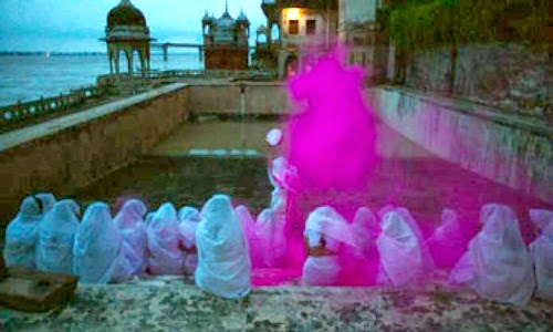
The
movie opens with a vision of a murky and gloomy river and the women in white
sarees. A burst of gulal in the air above the women is a sign of things to come.
Myriad emotions are captured in simple gesture. The many lonely years of being
and the melodic, haunting sound of Bishi conveys the melancholic feeling
experienced by the women. And then, just like that, the color spreads in the
air giving a sense of joy and of the opportunity to have colors in their life
again.
 |
| Holy Holi |
The
vivid couture created by Manish shows the freedom to play with colors. The naughty
pinks, flamboyant reds and psychedelic colors capture the colorful festival of Holi
and how everyone, without any discrimination, has the right and the freedom to
indulge in it.
 |
| Holy Holi |
Holy
Holi won several awards at ASVOFF (A Shaded View On Fashion Film Festival) in
Paris. Through this fashion film Manish Arora has pushed the creative envelope
and included something new. He even showed fashion is not only about models in trendy
clothes but also a way of expressing deep emotions often ignored by society.
Subscribe to:
Posts (Atom)